Farah Vintage is a historically American brand, born in the 1920’s with a fairly rich history that includes a stint making military garments. Today, I know of Farah from a distinctly British perspective, recognising their fair history and their distant love affair with the UK’s subcultures. Since 2007 when I first bought something, I have followed their progress, on and off, over the years with only mild interest. Then, a few months ago they won Drapers Menswear Brand of the Year.
I don’t know loads about Farah except that they are owned by Perry Ellis, who also own Original Penguin (it seems to be a complicated company with UK, EU and US branches and arms all over the place, dealing with all sorts of other brands). Both Farah and Penguin are American brands and they have a turbulent history falling foul of the brand cycle over and over (as many brands do). I’m going to guess that the Perry Ellis take over happened in around 2004/5 for Farah (a couple of years to do some re-structuring, a couple of years for the new collections to come through to retail), as in 2007 I picked up a lovely cashmere cardigan from TK Maxx (many great brands have been there and bounced back!). It’s a great quality item, it’s lasted brilliantly, it’s a great fit and it still looks fairly current despite being bought years ago.
At the time I was unaware of the brand, I just liked the fact the cardigan was reduced from £90 to £20. Then a year or so later I started to see Farah being stocked in Selfridges and Urban Outfitters. I don’t care what anyone says, these two stores’ buyers know what they are doing and their brand mix for their menswear is always fresh and commercial so they’re always worth a snoop around.
Someone was making a conscientious effort to turn this brand around, the product was great, but from a consumer perspective there just wasn’t enough noise about them.

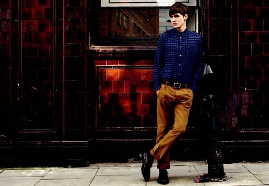
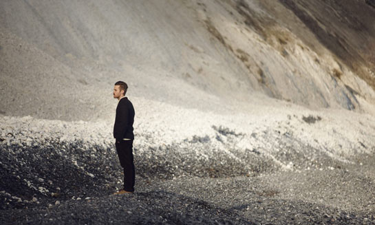
The imagery that they were using was a little bit naff and cheesy but I can see what they were doing with it. The message is clear it was a hark back to their 1970’s/1980’s British sub-cultural roots. They are going for the casuals/mod/urban-deprived-youth look that was very popular around 2007-2010. This facelift was probably what they needed to get into some of these leading menswear departments in such prominent stores. Farah also released their 1920 range to remind us all of their long history, (the heritage thing has been pretty big for a while now too, you can’t move for brands trying to tell you their story) however I don’t think I’ve ever seen it in a store.
Farah are probably best known for their trousers. They made work pants and work shirts during the 1930’s and 40’s and then shifted to make military uniform. These industrial, work-wear and military roots don’t seem to come through as strong influences in their collections and this does seem like a shame. They seem to focus a lot on their sub-cultural roots instead and as fickle as this sounds, I’m just a bit bored of everyone doing that. I like the way that Red Wing, Carharrt and some other American brands (albeit their European Licensee counterparts) have started to lean more heavily on their industrial past rather than dream up some relationship with a 70’s subculture like everyone else.
Farah’s chinos are a fantastic fit though. They aren’t too slim through the leg, yet they are gently tapered so that they don’t have a wide ankle opening. They also fit properly around the waist, they don’t have a dropped crotch which is quite refreshing. It seems they have stuck to a faithful shape and only made small changes to modernise the shape so that you get that slightly old fashioned feel without looking like you raided a charity shop. They are gentleman’s trousers, the epitome of ‘smart-casual’.

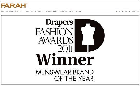
In 2011 Farah Vintage won Drapers Menswear Brand of the Year. Initially I was really shocked, I mean they don’t even have a functional e-commerce site (tut tut, this is 2012 Farah!) and they were also up against some reputable competition from the likes of Ben Sherman (huge investment in 2011) and Lyle and Scott. On reflection though I think it is fantastic for Farah to have won this, I feel like they deserve the recognition as on the 2 occasions I have come into contact with their products I have been very pleasantly surprised by the quality and cut, however they don’t seem to be overly prominent in the marketplace.

If you’re looking for some great fitting chinos I’d strongly recommend Farah Vintage. They are stocked in Urban Outfitters as well as having opened a store in Shoreditch’s answer to a shopping mall- BoxPark.


